


Case Study Orion
Goal
Upgrade the B2B card management solution to a responsive web app, standardize branding and incorporate a seamless native app user experience.
Role
As the Lead User Experience Designer on the project, I led a highly collaborative design effort with 6 lead software developers, 4 product owners and a team of over 30+ onsite developers. By leveraging my leadership and design expertise, I enabled our team to work together seamlessly towards a common goal.
Tools
Design Systems, UX Research, Figma, Rapid Prototyping and Agile Methodologies

What is Project Orion?
Orion is a B2B solution that offers card management services to clients and their customers. However, as a legacy application, Orion requires modernization to position it as a SaaS-based solution for clients and their existing customer base. The modernization process includes making responsive web improvements, incorporating a design system, standardizing the brand, and developing a native application platform.
Competitive Analysis
I conducted extensive market research on various banking solutions to find the best personal credit card management experiences on the market. The research was designed to gather comprehensive insights into the features and functionalities that are most important for users when they log into their personal banking experiences.
Based on the data collected from the research, I was able to develop a user interface design that is not only visually appealing but also highly engaging and intuitive for users. By focusing on the needs and preferences of users, we can ensure that the product experience we offer is tailored to their requirements and provides them with a seamless and streamlined credit card management experience.
What were the key findings of the market research?
The study found that modern typography, which focuses on high contrast and readability, effectively creates visually appealing designs. Additionally, using white space can help build focal points and direct the user's attention to specific parts of the layout, particularly on account dashboards. Finally, a modern color palette can enhance the design, prolong user engagement, and promote ease of use with the website or app.
What specific features and functionalities were identified as crucial by the users?
Competitors have emphasized the importance of promptly displaying customer information through widget or tile UI design patterns in a quick and accessible manner. This involves providing summary-level information about an account, which enables users to make better-educated decisions about their personal financial health. Some of the specific features and functionalities that have been identified as crucial for users include; credit card spending balance and available credit limit, rewards balance, transaction history, the ability to make payments, quick discovery for quick actions, and family card management.

Findings from interviews
Preliminary design interviews were conducted with ordinary customers of banking products. We gained insight into what they value in a banking dashboard experience.
INTERVIEW INSIGHT #1
Customers want quick access to balances
Faster access to monthly customer balances with summary level information displayed promptly upon login.
INTERVIEW INSIGHT #2
Notification center that communicates card activity
Quickly communicate to the users when activity has successfully been completed, including refunds, bill pay and any other account resolutions that have been completed.
INTERVIEW INSIGHT #3
Cleaner experience with viewing information
More white space in a banking dashboard will give a cleaner and more visually appealing view of customer data. White space is crucial for creating clear and contextual data, while guiding the user's attention from one element to another.
INTERVIEW INSIGHT #4
Display a clear summary of my monthly subscription charges
Customers want a clear and concise breakdown of monthly subscription charges by category, such as music, movies, or magazines, along with a summary of all charges.

Opportunities for modernizing legacy user interfaces
To modernize the legacy user interface, we can create user stories around typical workflows and get them user tested. This will allow us to receive real-time feedback, ensuring that we are heading in the right direction. Additionally, we can introduce lifestyle imagery for client brands and make the product accessible on mobile phone devices.
Target Personas
Personas represent typical users for the digital engagement experience. By identifying the needs and wants of the target audience, the early stages of design and future iterations will be more effective.
Challenges in Acceptance
There are some challenges we need to overcome when it comes to acceptance. For instance, we need to adopt the use of white space in the design from product and client stakeholders. Moreover, we need to explore the use of modern typography for the user experience.
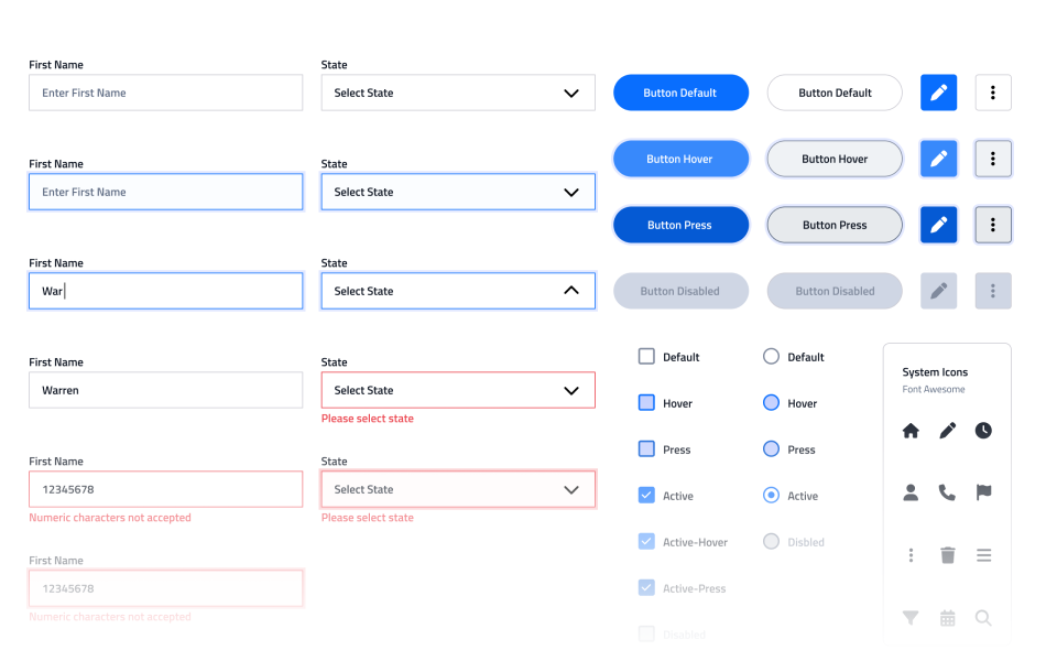
It is crucial to emphasize that building customized dashboards using our dashboard widgets is a highly flexible and efficient approach. We have developed these widgets as dynamic components that can adjust based on the user profile being logged in. Therefore, it is imperative to ensure that product owners and stakeholders understand the potential benefits of using our widgets to create dashboards tailored to their specific needs.
We are determined to overcome the challenge of garnering support for our visionary approach to widget-based component development. Our goal is to empower users with categorized data summaries that seamlessly lead them towards completing various actions within their logged-in experience.
User Flow Diagrams
Registration flow chart
This flowchart displays the standard process of becoming a registered user on the digital engagement experience.
Login flow chart
This flowchart displays the standard process of logging into the digital engagement experience.

Visual Design
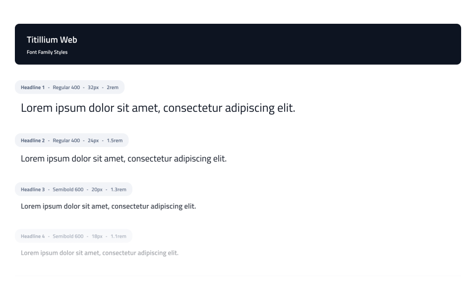
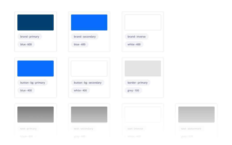
I created a comprehensive color palette consisting of a wide range of hues, shades and tones that will be used consistently throughout the product. The typography style that was chosen will be applied uniformly across all design elements. Additionally, a design system was developed to ensure consistency in the visual style and layout of the product. This system includes clear guidelines for typography, color usage, iconography, and overall design principles.
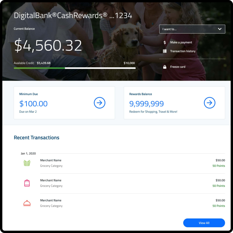
High Fidelity Wireframes
The following high fidelity mockups demonstrate examples of the user's account dashboard that will be available upon successful login. After logging in, users will be able to view their account balance, transaction history, rewards balance, and get notified if their bill is due.
As part of the Orion project, it is a requirement to provide mobile mockups to demonstrate how the site will appear on smaller devices.

Reflective Analysis
I strongly believe that user testing is an essential tool to gain a deep understanding of user needs. It offers users the ability to express themselves fully and provide specific feedback to improve the product. This enables designers to create dashboard layouts more efficiently and add significance to personalized experiences.
Based on my understanding, some users still feel anxious about accessing their financial information on their personal phones, as they fear their identity or data could be compromised. However, we can assure them that we take their security very seriously. As such, we offer additional verification methods to confirm that it is indeed the user logging in, such as two-factor authentication, which adds an extra layer of security. Moreover, we provide a broad range of security settings within the profile page of the banking application. Our platform is designed to keep our users' data safe and secure, so they can enjoy a worry-free banking experience on any device.